.png)
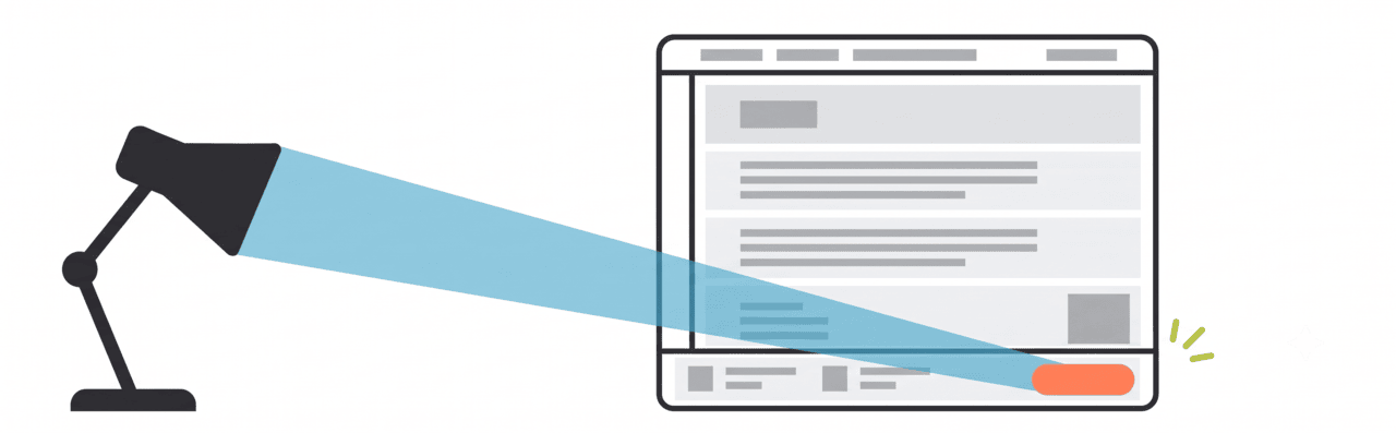
8 Proven High-Converting Landing Page Optimization Strategies in 2026
.png)

.png)

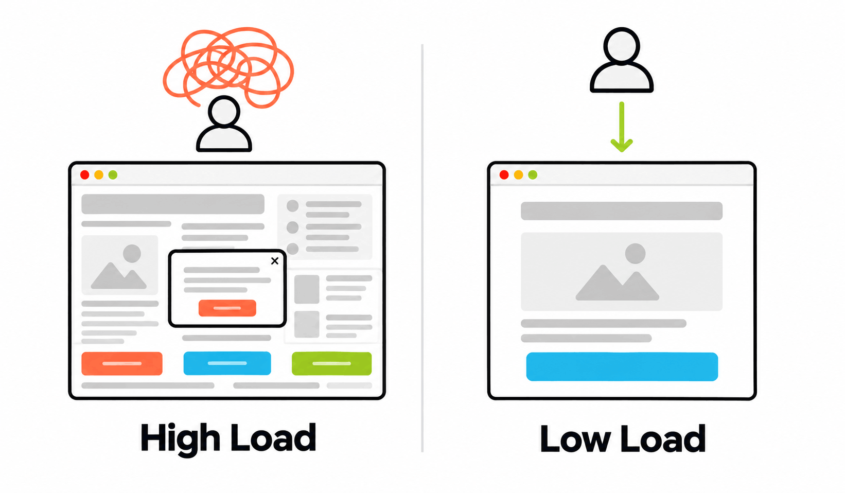
A high-converting landing page is a single-purpose destination optimized to turn visitors into customers by minimizing cognitive load (the mental effort required to take action).
Success in 2026 relies on message match (continuity between ad and page), mobile thumb-zone design (placing CTAs within visible reach), and benefit-driven micro-copy (focusing on user outcomes).
By integrating social proof and high-contrast visual cues, these pages reduce friction and maximize ROI.
Key Takeaways
- Matching landing page text with user intent improves conversions
- Shorter forms increase completion rates
- Benefit-driven language improves clicks
- Clear visual hierarchy guides attention
- Social proof builds trust and reduces hesitation
Article Overview
This article explains eight ways to improve landing pages in 2026.
It covers how to:
- Reduce effort for users
- Align messaging with intent
- Improve mobile usability
- Use clear and helpful copy
- Add trust signals
- Use modern tools for testing and tracking
Why A Good Landing Page Leads to Maximized Conversion Rate Optimization
A good landing page reduces the effort required to make a decision by aligning with the user's intent and removing distractions.
When a page reduces cognitive load, users do not have to think as much. This helps them act faster.
A strong landing page helps by:
- Match what users are looking for
- Remove extra steps
- Make the next action clear
- Reduce doubt
When things feel simple and clear, users are more likely to convert.
The Psychology of High-Converting Landing Page Design
Effective design guides user behavior through a clear visual hierarchy and intuitive cues. By placing key information where users naturally look first, it highlights the main benefits early. These design choices shape how users understand the page and influence their decision to take action.
1. Understanding Message Match and Relevance
Visitors look for immediate proof that a page solves their specific problem. If the text on the page mirrors the exact words a user typed into a search engine, it reduces friction. This alignment is a core component of conversion rate optimization because it validates the user's choice to click the link.
Case Study: Involve.me in 2025 realized that onboarding new SaaS customers leads to a steady drop-off rate. They A/B tested variations, with Version A offering product templates based on customer response and Version B providing the option to build from scratch or generate with AI.
Version B emerged to improve overall subscription and conversion rates. Streamlining the onboarding approach validated product value, as customers often already have an idea in mind.
2. Reducing Cognitive Load with Simple Layouts
Human attention spans are short, and complex layouts cause decision fatigue. Forcing users to fill out long forms or navigate through many pages leads to high drop-off rates. Simplifying the journey respects the user's time and makes it easier to finish an action.
Case Study: The fintech company PayU improved its checkout rate by 5.8% by removing the email address field from its onboarding process. They found that requiring both a phone number and an email created unnecessary friction.
3. Organizing Visual Hierarchy and Reading Patterns
The way information is organized on a screen dictates how users absorb it. Most users do not read every word. They scan, with common patterns including: F-pattern for text-heavy pages, or Z-pattern for simple layouts
This means designs should show the main benefit first, use clear and scannable headings, and highlight key actions to guide user attention in the right order.
Case Study: Zalora tested this by moving the word Free to the far left of their text. By changing 30 Days Return to Free 30 Days Return, they ensured users processed the benefit immediately. This small change to the visual hierarchy improved their checkout rate by 12.3%.
4. Deploying Mobile-First Design and the Thumb Zone
Modern conversion rate optimization requires prioritizing mobile users. Design must account for how people hold their phones. The area of the screen that is easy to reach with a thumb is the most critical space for interactive elements.
.png)
Case Study: New Balance Chicago in 2025 integrated online mobile browsing with in-store benefits. Their landing page was also redesigned to simplify navigation, enlarge product images, and ensure store location details are clear with a pinned Google Maps address. This led to increased in-store visits from online visitors; spending half the cost for this campaign while driving 200% sales.
5. Using High-Contrast Colors
Visual psychology uses color to reduce the time a user spends searching for the next step. High-contrast colors like orange or gold help buttons stand out against the background. This contrast makes the call to action the most obvious element on the page.
Case Study: World of Wonder in 2025 ran an A/B test on CTA colors and size, with high-contrast, action-oriented buttons achieving a 29.74% increase in sign-ups. Having the button designed to pop against a solid background grabs the user's attention and eliminates time spent searching for the next action point.
The goal is to use colors to act as a visual guide that directs the user toward the goal.
6. Effective Call-to-Action (CTA) Phrasing
Modern strategies have moved away from generic commands like Submit. Effective buttons now use phrases that describe a clear benefit or outcome. For example, the phrase Get My Free Audit signals immediate value and tells the user exactly what they will receive.
Case Study: Coding platform Kissflow improved demo page conversions with 2x more signups by replacing standard layouts with clear, benefit-focused content that communicated product value and an optimized CTA button. Users are more likely to act when they feel they already own the benefit being offered.
7. Increasing Exclusivity and Value Perception through Copy
Words that emphasize exclusivity tap into the human desire for premium status. Generic sign-up requests often feel like chores. When a brand shifts the focus toward immediate gratification, users are more likely to engage.
Case Study: The platform Going changed its button from Start Free Trial to Get Premium Access. This small change in micro-copy shifted the focus toward the value of the service. As a result, trial start conversions increased by 104% month-over-month.
8. Adding Social Proof and Trust Signals with Customer Reviews
Consumers look to others' behavior to establish credibility. Meetanshi Consumer Behavior Trends in 2025 shows that 54.7% of people read at least four reviews before buying anything. Bringing these reviews directly onto the landing page helps reduce purchase anxiety.
Case Study: The marketplace BorrowMyDoggy in 2025 places photos of real customers alongside reviews on its page, addressing common objections new users might have.
Service company Taylor Made Marketing in 2025 also uses localized messaging to build trust with specific audiences, leading to steady sales growth over time.
Tactical Guide for Increasing Landing Page Conversion Rates
The following data summarizes specific methods used to improve website performance. Each strategy focuses on reducing user effort and building trust through clear design and direct language. These tactics help transform casual visitors into confirmed customers by prioritizing clarity.
Modern Tech Stack for High-Converting Landing Pages in 2026
High-converting landing pages use fast, flexible tools (systems that allow quick updates and changes) like headless CMS (content managed separately from design), edge-side personalization (real-time content changes based on user data), and frameworks like Next.js deployed on Vercel. These tools improve speed, personalization, testing, and user experience.
Key Technologies and Tools
Why This Stack Matters
This modern stack helps landing pages:
- Load faster
- Show more relevant content
- Scale across campaigns
- Improve through testing
Better speed and clarity lead to higher conversions.
Final Thoughts
The success of conversion rate optimization depends on continuous testing rather than subjective opinions. Use the following steps to begin improving page performance immediately:
- Identify unnecessary form fields on the current landing page to shorten user action, reducing friction that leads to drop-offs.
- Compare the text in your advertisements or search links with the main headline of the landing page. Ensure the language is identical to confirm relevance for the visitor.
- Change the visual of the primary call-to-action button to a high-contrast color. This ensures the button is the most prominent visual element to direct users in the next action point.
- Replace generic commands with first-person, benefit-driven phrases that showcase product value to customers. Such as changing Free Trial to Premium Access, or Submit to Free Audit.
- Load the page on a mobile device. Ensure all buttons are positioned within the natural reach of the user's thumb to improve the physical ease of use.
Following these directives creates a logical path for the user and removes obstacles to sales.
Frequently Asked Questions (FAQs)
What is a high-converting landing page?
It is a specialized webpage designed to drive a single specific action. It uses clear language and mobile-friendly layouts to guide users toward a goal, such as a sale or signup.
How do colors affect conversion rates?
High-contrast colors like gold or orange make call-to-action buttons stand out. This reduces the time users spend searching for the next step, potentially increasing conversion volume.
Why is "Message Match" important?
When a page mirrors the exact words a user searched for, it provides immediate proof that the page solves their problem. This validation reduces friction and encourages the user to stay on the page.
How does mobile design impact user behavior?
Mobile optimization focuses on the "thumb zone," ensuring interactive buttons are within easy reach. This physical ease of use prevents frustration and improves retention.
Read These Next
B2B Conversion Rate Optimization Strategy for Complex Sales Funnels
%20Mobile.png)